
Main menu
The main menu is at the top of every page of your website. It holds all the main links for navigating your website.
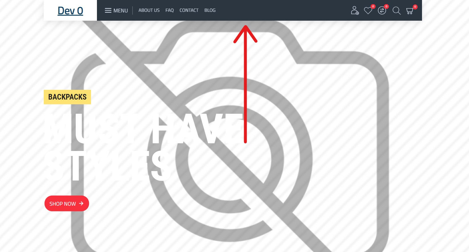
Desktop and mobile menu versions
Several templates are reserved for the menu, so first you need to find out which menu to edit. In most cases only two templates are used: one for the main menu on the desktop website and another for the menu on mobile devices.
To find out which templates are used, go to Journal > Skins > Default > Header.
You’ll arrive at this page:
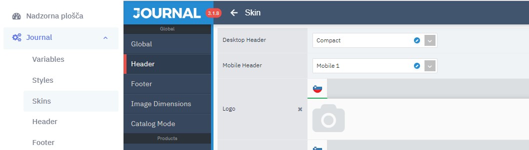
In our example, the templates used are “Compact” for desktop browsers and “Mobile 1” for mobile devices.
Editing the menu
Now that we know which template is used, we can start editing the menu. Go to Journal > Header > Compact (in the “Desktop headers” section). In the last step, remember to choose the template used on your website instead of Compact (you found it in the previous step). The same applies to editing the main menu for mobile devices.
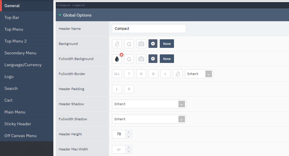
General
General menu settings.
Top Bar
Settings for the bar above the menu; it usually contains the language switcher.
Top Menu
Settings for the menu in the bar above the main menu.
Language/Currency
Settings for the website language and the currency used.
Logo
Settings for showing the logo in the main menu.
Search
Settings for your website’s search.
Cart
Settings for the cart in the menu.
Main Menu
This section contains several modules. The first two are the key ones: the first is for layout, the second for style and design. Click the blue pencil icon to quickly edit their settings. The pop-up window shows all the blocks in the main menu. You can edit each one, and add new ones by clicking the “+” icon below the last block.
Sticky Header
As you scroll the website, the main menu usually disappears and a “Sticky Header” menu appears, usually reduced to the main features. You can edit these features in this section.